The Role
- User Research
- User Interviews
- Journey Mapping
- Sketching
- Wireframing
- Screen Flows
- Visual Design
- Interaction Design
Project Summary
I was contacted by Dosh, a remote team that had the drive to reinvent personal finance. I was the only designer on their team of engineers and led the design and discovery phase of this project. Conducted all of the user interviews and user tests. I led efforts to evolve the service and address customer pain‐points related to the spending and planning experiences.
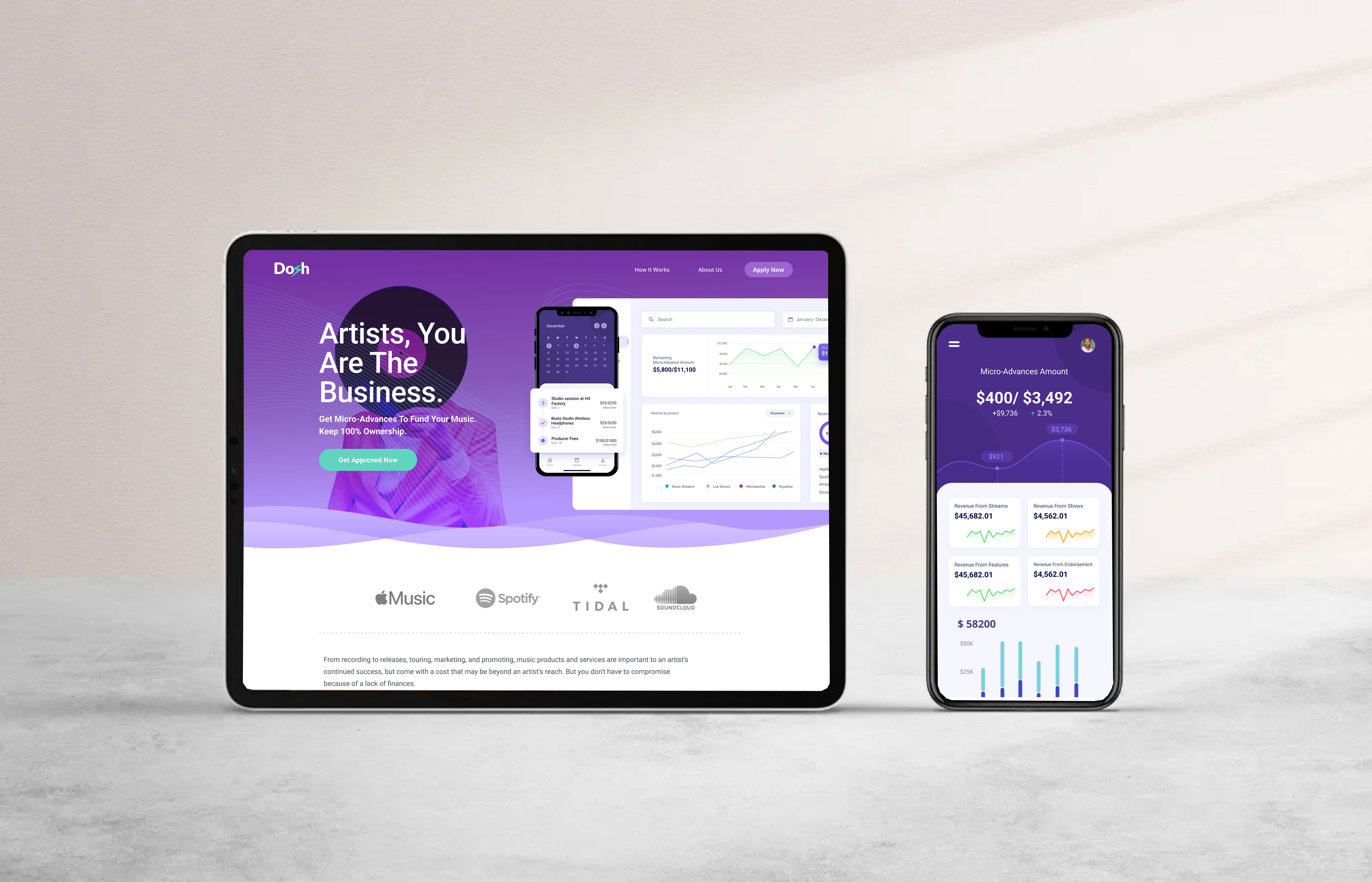
Empowering Creators to Thrive Financially. The Smart Way to Manage Your Creator Business.
The Challenge
The targeted audience couldn’t find a convenient way to pay for everything and also invest from one platform, without changing various apps.
Managing money is overwhelming as users are not able to keep track of their overall expenses.
Targeted Users couldn’t find a proper funnel to pay or invest from multiple cards they own, from a single app and keep track of all the transactions that took place from multiple cards without any hassle.
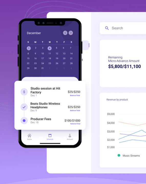
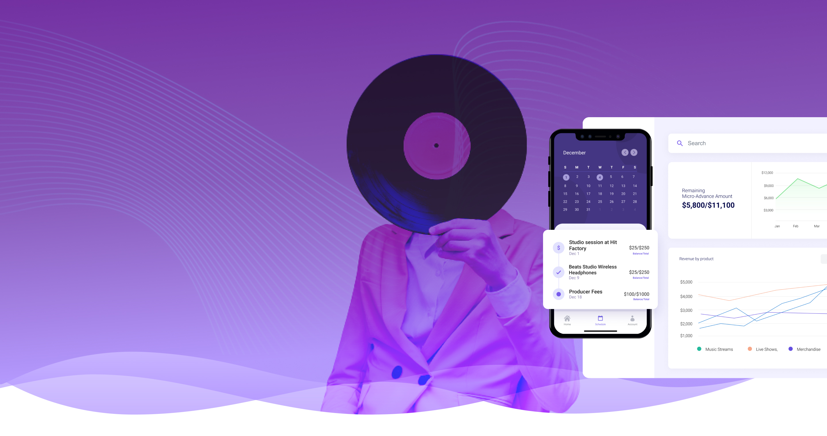
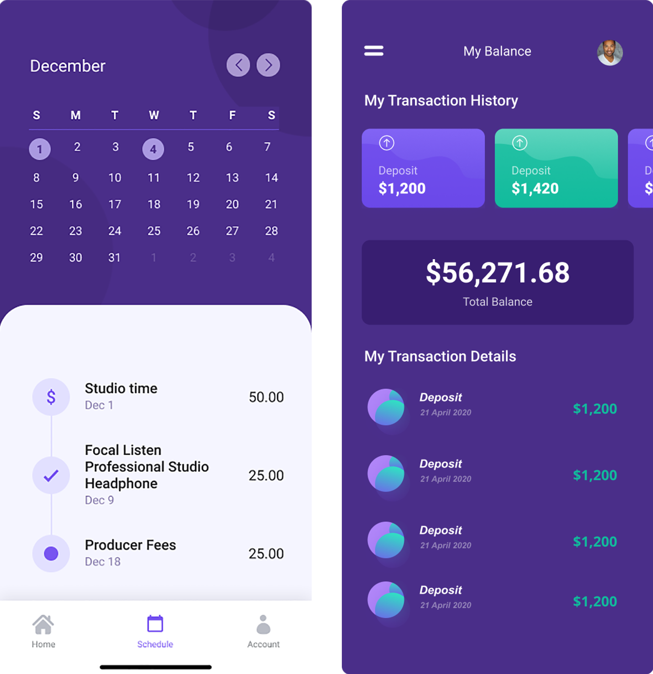
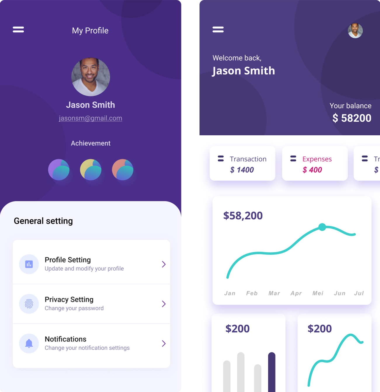
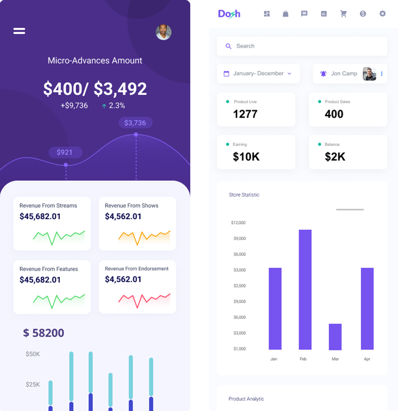
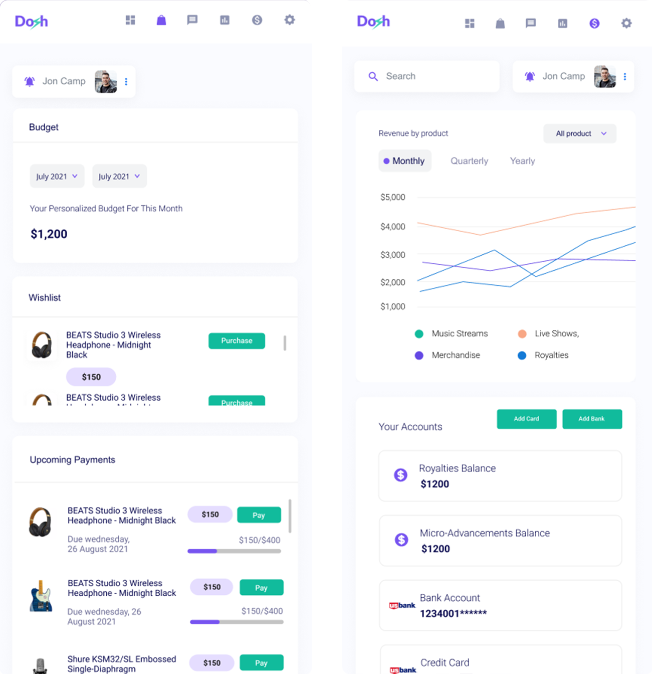
For better control of money, we made features that will help users to record transactions. Also, the visualized category will help them to identify clearly different segments of expenditure. To make investment easy and accessible we have collaborated our app with the stock market so that they can directly explore from this app and invest.
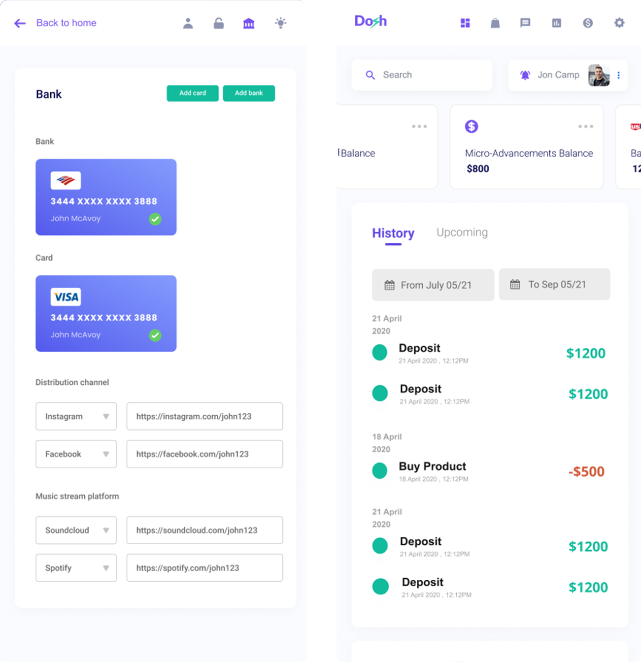
Users can add multiple cards in this app and track money easily. They can invest, pay, or spend easily without shuffling through different apps thus hassle-free money management.
The Goal
For better control of money, we made features that will help users to record transactions. Also, the visualized category will help them to identify clearly different segments of expenditure. To make investment easy and accessible we have collaborated our app with the stock market so that they can directly explore from this app and invest.
Users can add multiple cards in this app and track money easily. They can invest, pay, or spend easily without shuffling through different apps thus hassle-free money management.
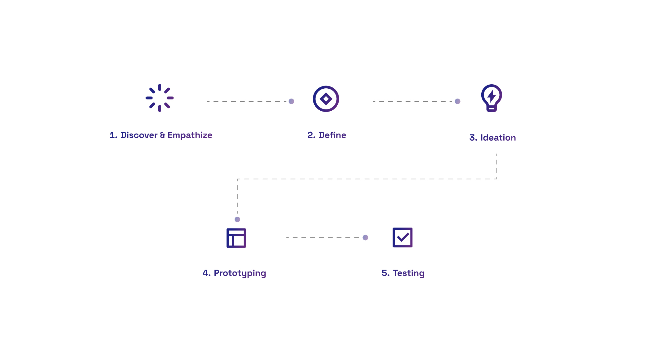
My Design Process
The design process that I followed consisted of 5 stages.
- Discover
Discover, where I conducted Secondary research and Interviews followed by validation - Define
Where I explored the creation of personas, and defining project goals and the problem statement.. - Ideation
Ideation, where Information architecture helped create the structure and the content - Prototyping
Prototyping consisted of visual design and wireframing, before building the prototype. - Testing
Testing it with users in the final stage.
Phase 1
Discover
& Empathize
User Interview
To know more about users I interviewed 6 people to understand what method they used to write their daily Incomes and expenses and what they like or dislike about the current method. I conducted some telephonic interviews while some I ran in person for this user interview, I asked each one of the users to use the app for a week as I wanted to see how they will interact with the app’s features.
To see how they interact with the app I prepared a questionnaire. Some of the questions I asked them were:
- Before using this app what method were you using to record daily expenses and Income
- If yes, then what method do you use?
- if not, then how would you manage your expenses
- Did you like your old method?
- If not then Why not? If yes then what did you like in that method
- Did you like the app?
- what features did you like in the app?
- what features frustrate you?
- what would you like to change in the app?
- what more features do you want in the current app?
Competitive Analysis
I researched apps related to finances, budget and habit-building and I end up with 7 apps. Then I filtered the ones related to financial management as they could be the main competitors. At this point and I was looking for their current features, and the overall experience using some of them. Here are some features I found related to the opportunities of the research:
- 2 of the 7 apps sync bank accounts automatically
- 1 of the 7 reads SMS from the bank and add as a transaction — the person has to copy the message and add in the app
- 4 of the 7 send notifications
- 7 of the 7 apps use charts to illustrate some expenses and transactions
Phase 2
Define
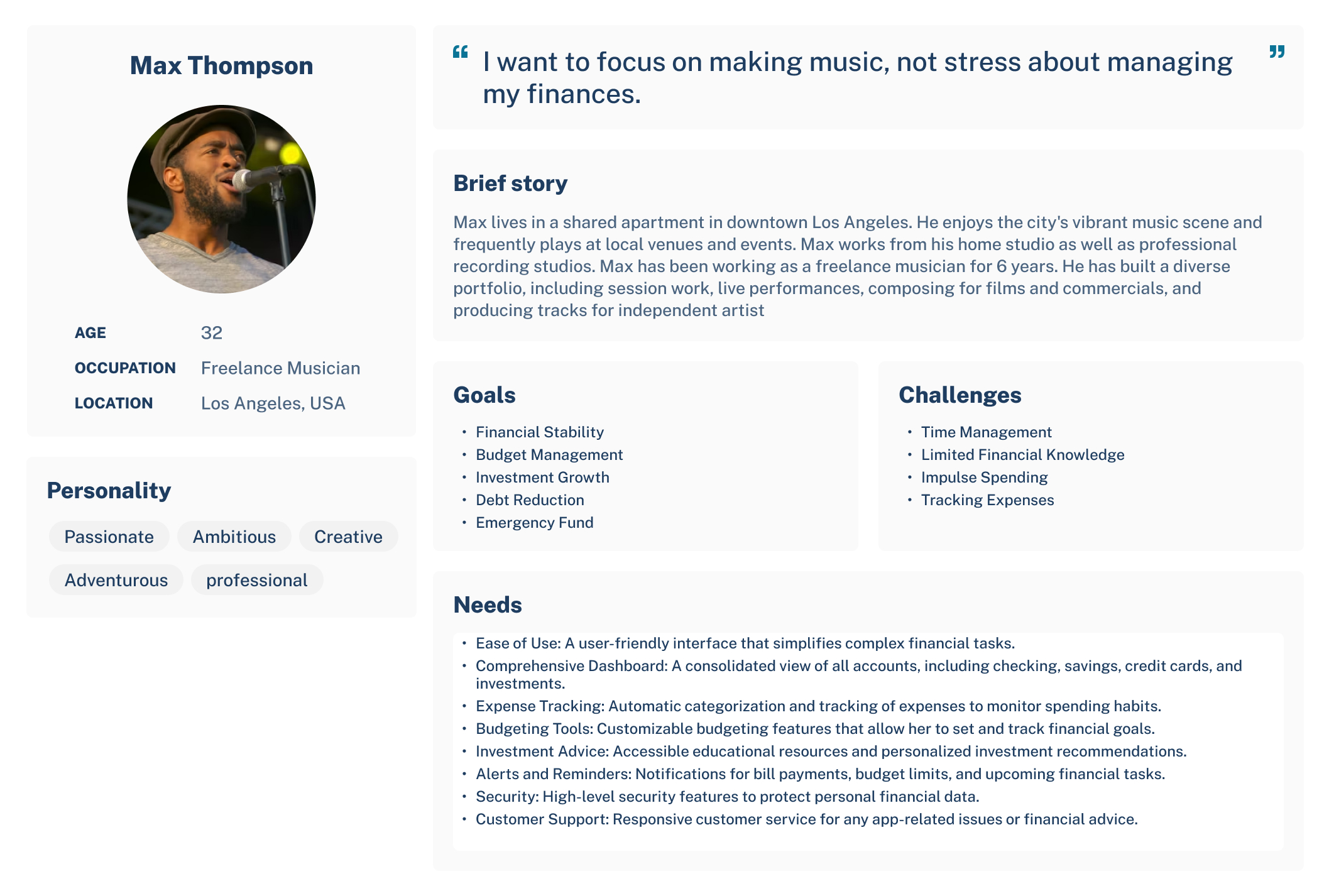
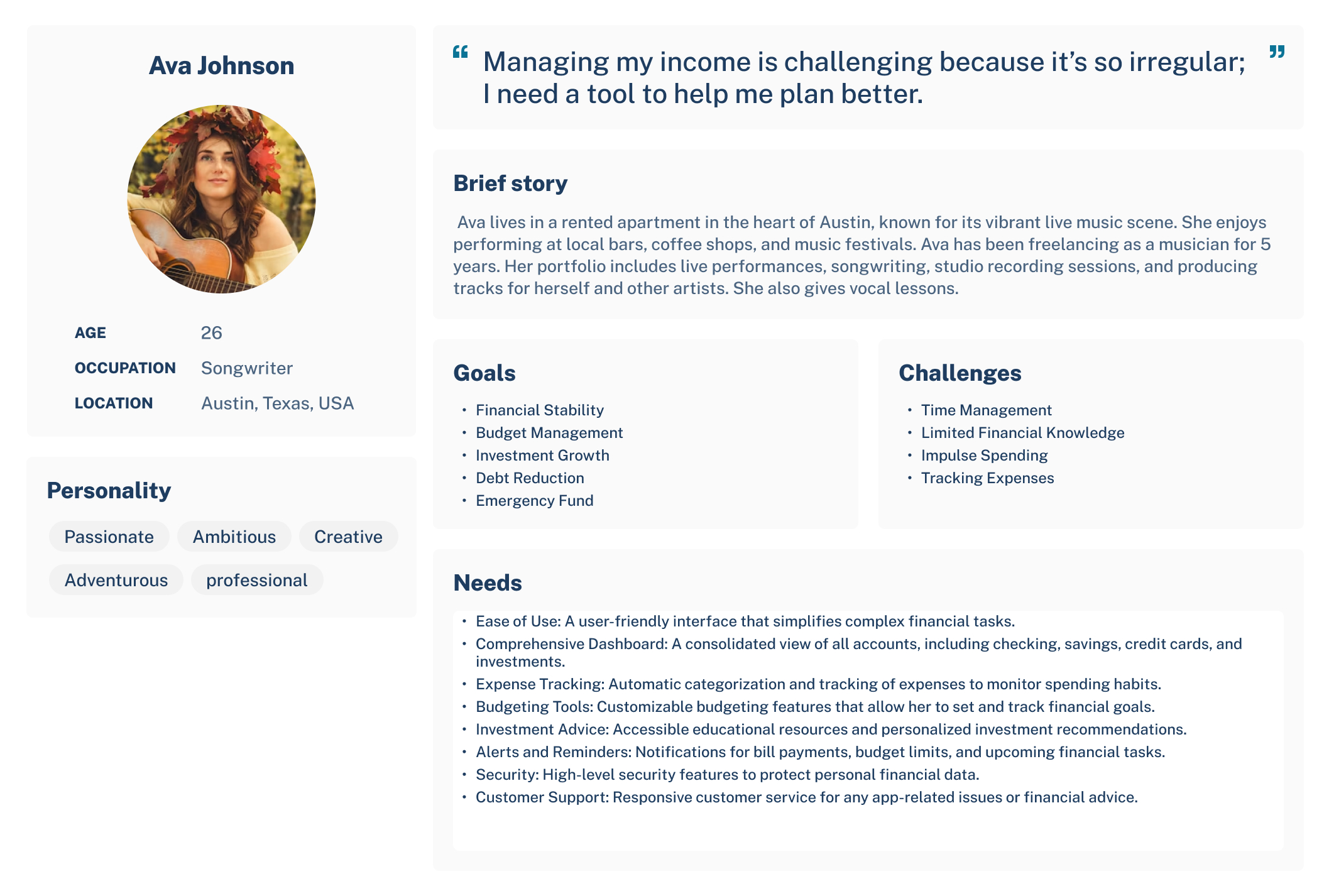
User personas
From the above information analysis from interviews, observations, and secondary research, I created a solid user persona which further helped me define the goals and scope of the project. Based on the information gotten from the foundational research, I created a persona whose demographics, motivations, goals and frustrations represent the needs of the users.
Phase 3
Ideation
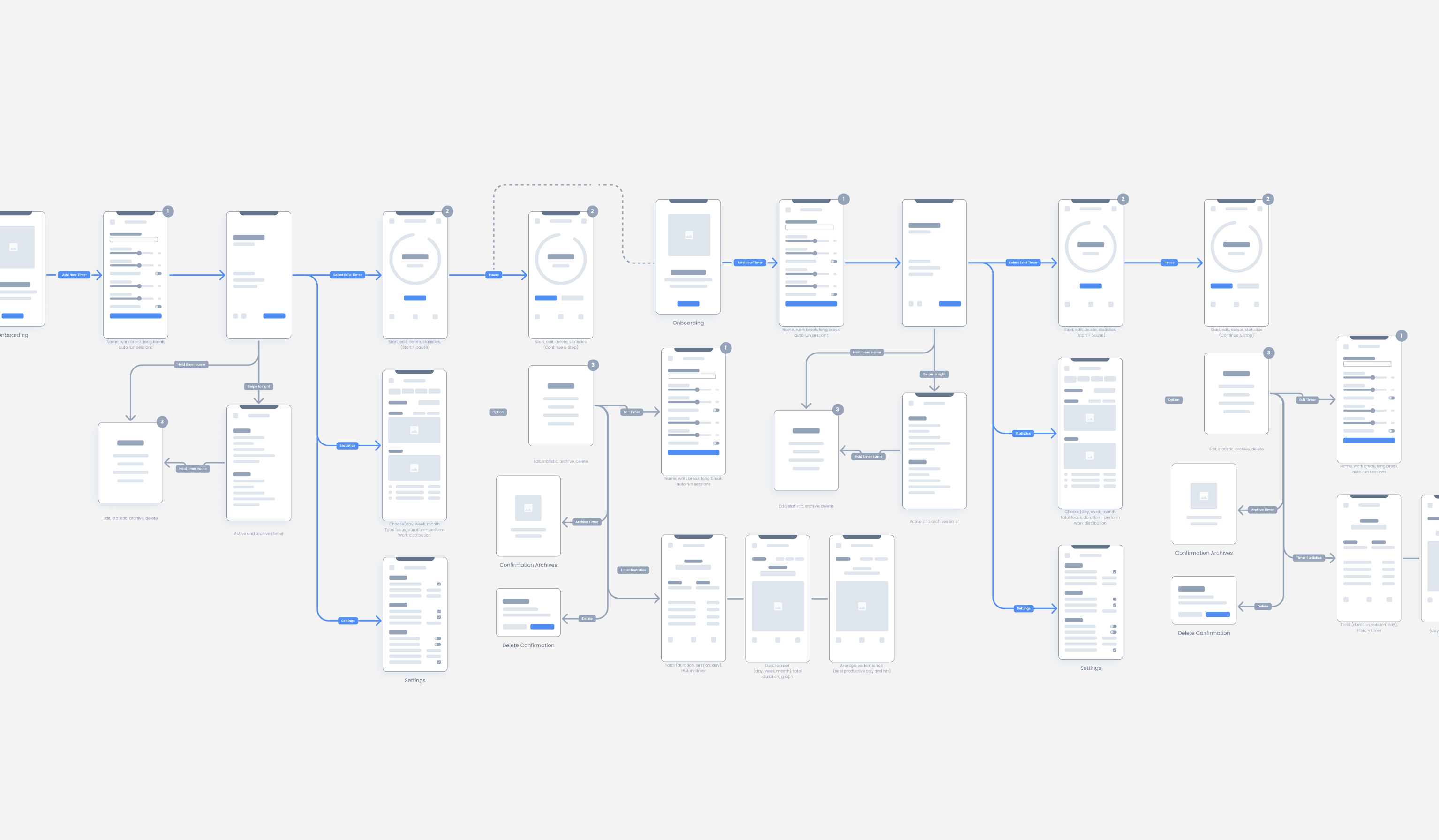
User Journey Map
Here I have covered details End User flow so we can have clarity in later on stages of project.
Phase 4
Prototyping
Low Fidelity Wireframes
Designing a website focused on raising awareness, and using a narrative approach to showcase the power of entrepreneurship and promoting local business.

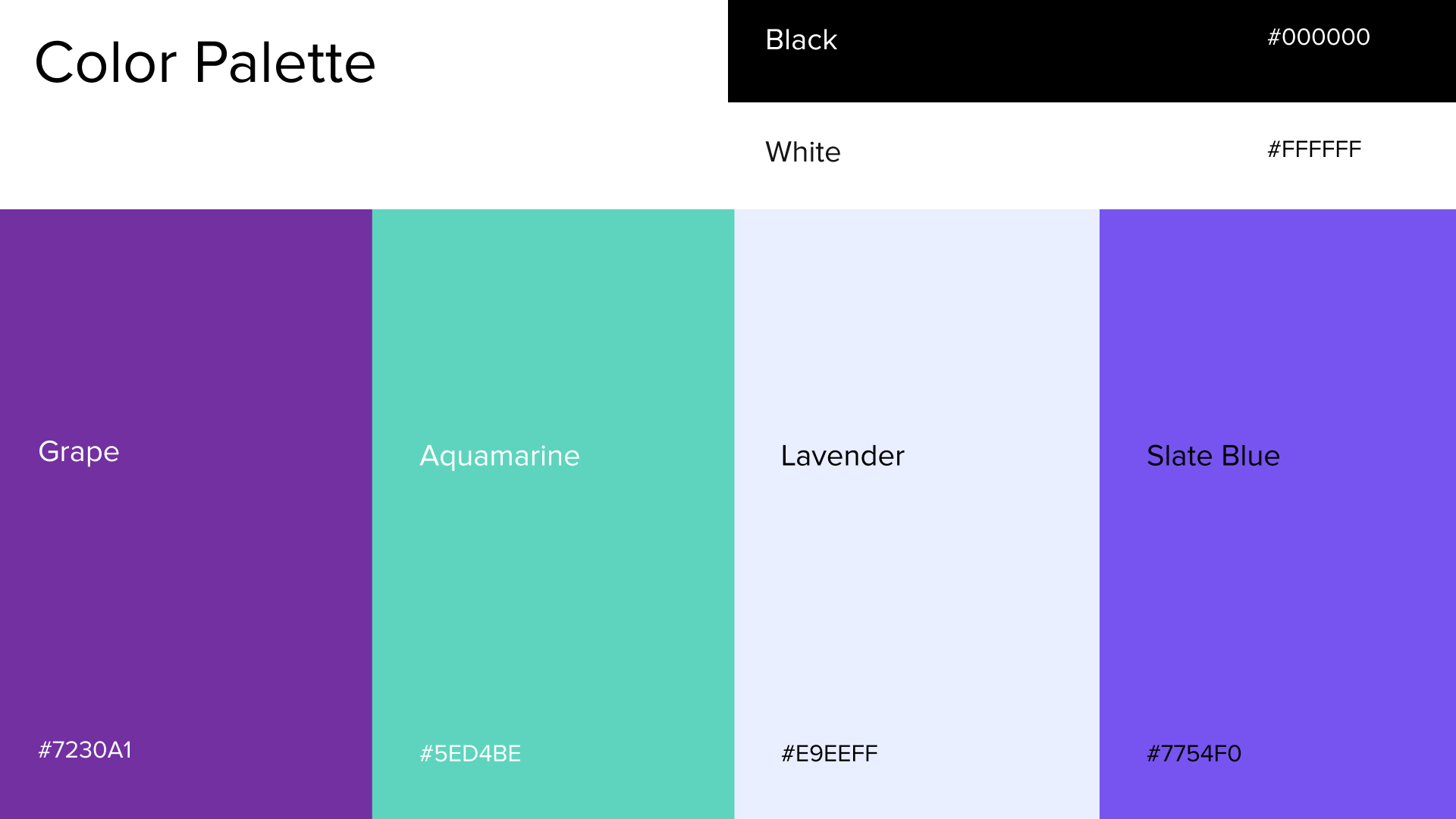
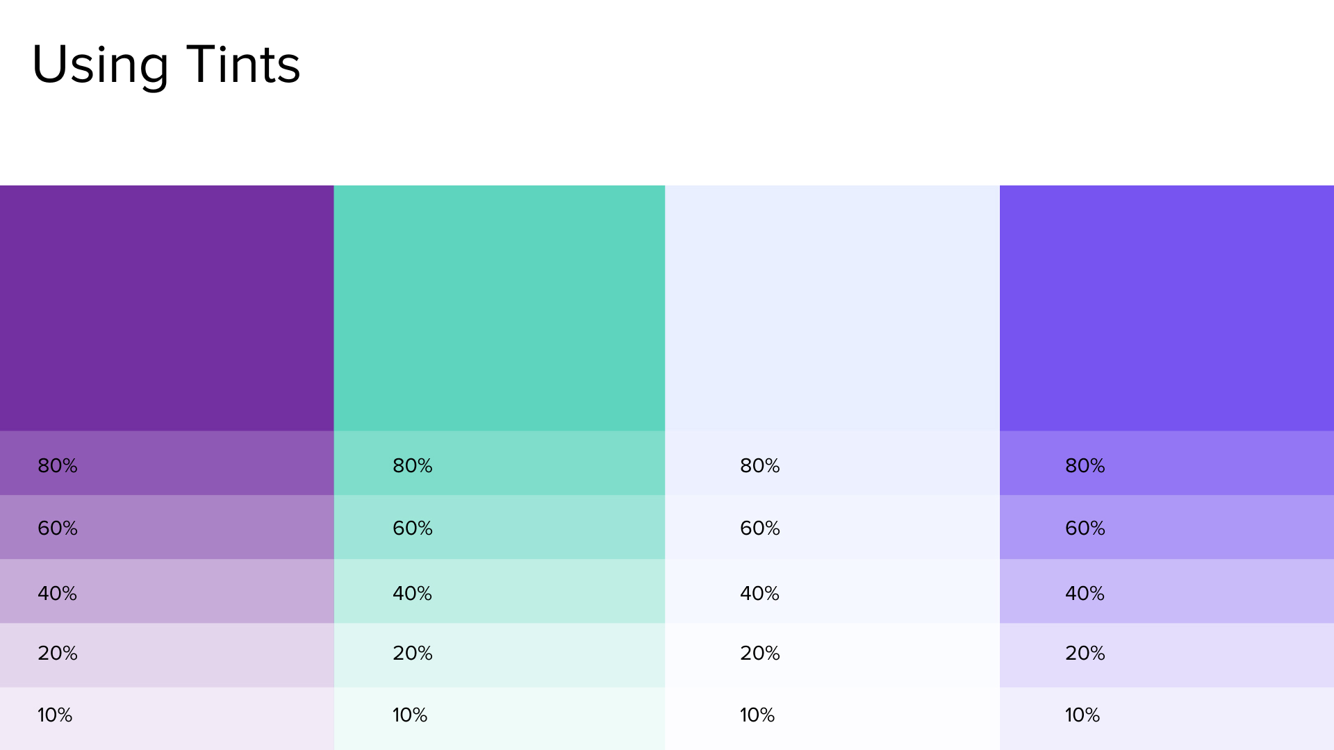
Color palette
It is necessary to ensure that the colour we choose to make them feel warm and secure as they are sharing various personal details.
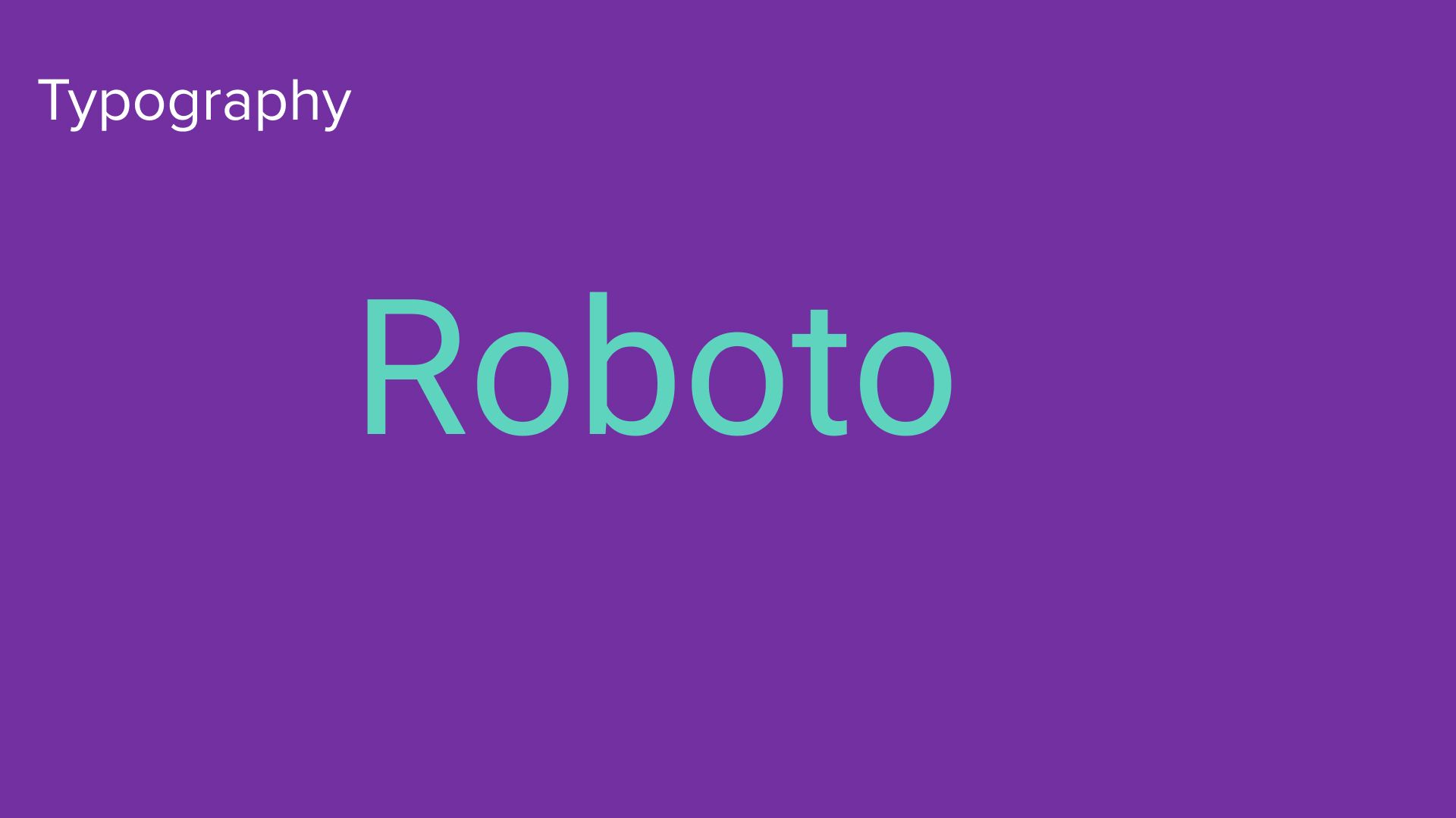
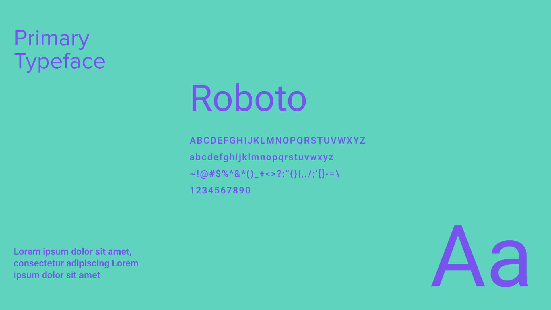
Typography
Choosing the right pair of fonts is very important as it determines the eligibility of the letters and words.
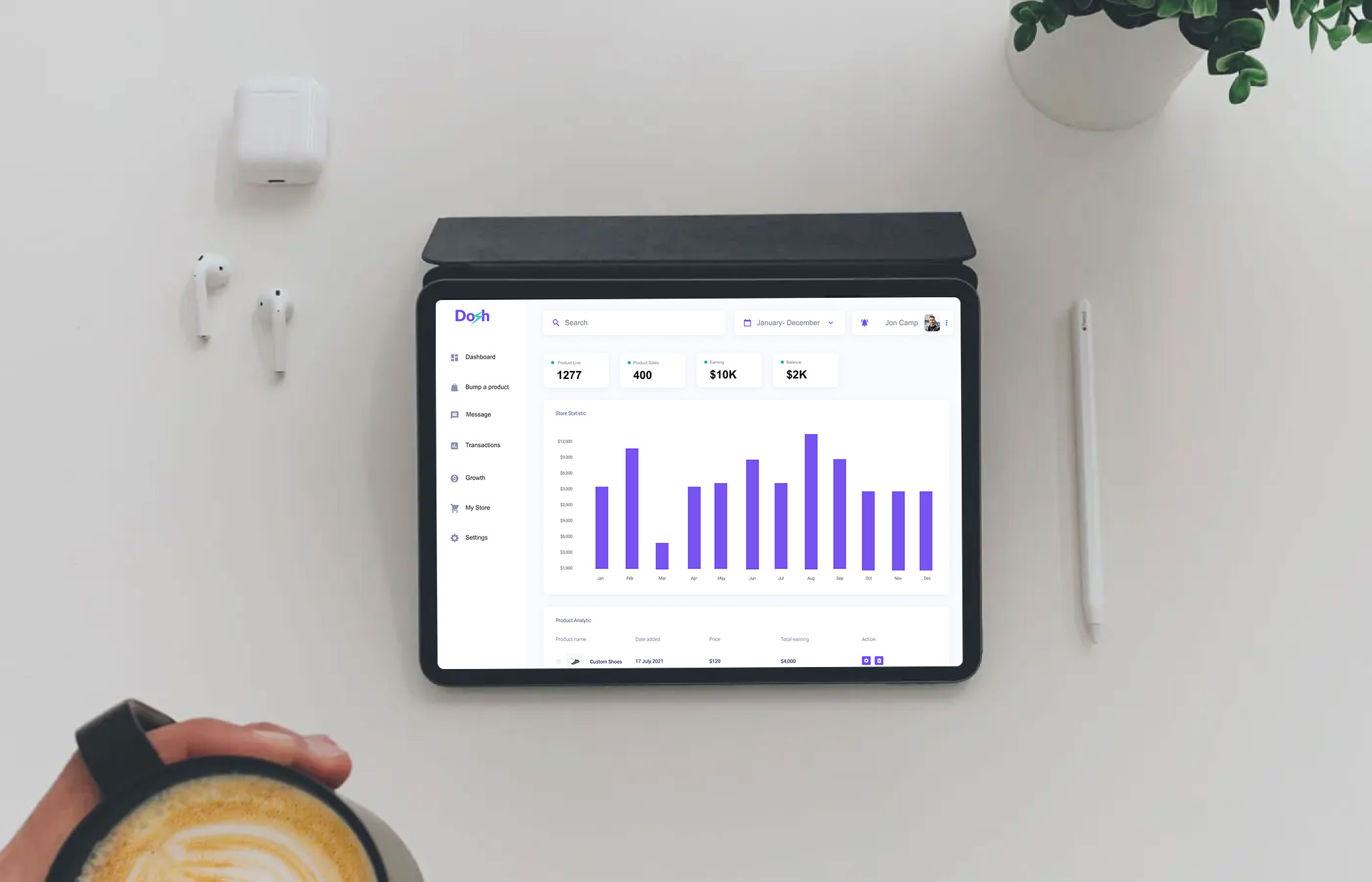
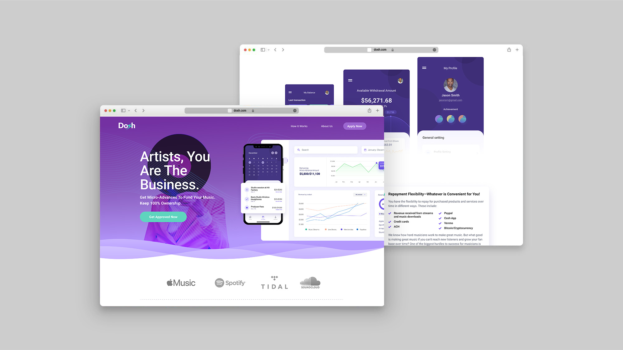
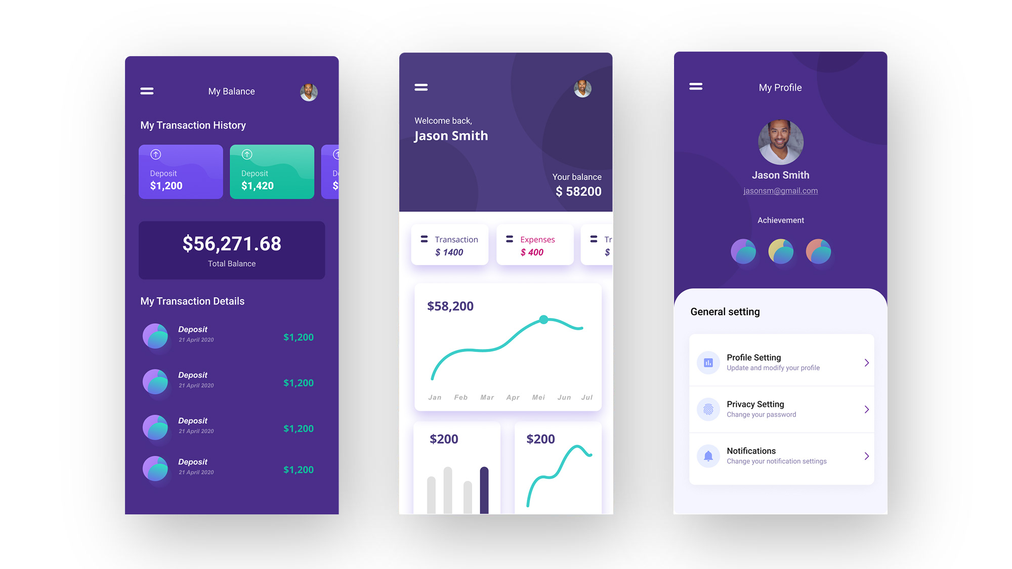
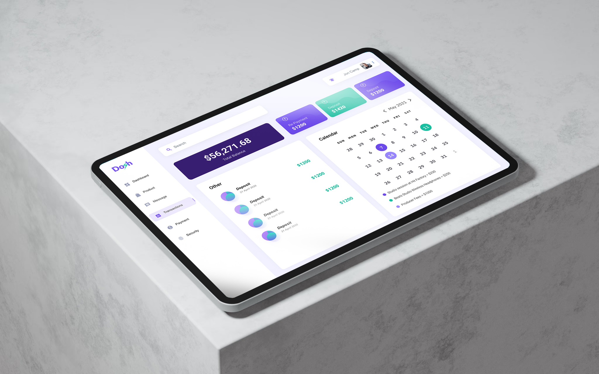
Final Prototype
I wanted the UI design to transport the fresh and clean feeling of drinking water. It should invite the user to use and explore the app. Lastly, I wanted to make use of the Material Design principle of elevation to make sure users understand the visual hierarchy of the different elements on screen.
After some iterations, the next step was to create the actual app screens. Due to my Wireframes, I had a solid foundation and was able to completely focus on the details of my designs.
Problems/learnings during this part of the process: As it seemed at this point, I did not completely think through what I wanted my prototype to do.

Phase 5
Testing
During this stage, I conduct a usability test for the app that was created through video calls and in-person interaction. By testing the design at this stage, I could observe an interaction that most closely resembles a real-life interaction with the final product.
Testing a product with real users helps give a new perspective on things: Through my usability studies, I was reminded that each individual is unique. So the best way to learn about the usability of a product is by testing it with different people.
The Outcome
Designing an app was challenging as well as rewarding journey. Challenge was to make the app with minimum cognition load and learning curve yet with great usability. Researching about the
delivery agents helped me to understand their needs and what
challenges they face and then finally making an app considering
user experience perspective and visual design perspective
Future work:
Extensive On field research.
Usability test of the prototype with the users.
Improve user flow.
Final Thought:
It was a great experience working on this project, knowing the
delivery agents and understanding the process gave me an insight
into the delivery ecosystem. I got to know the problems faced by
them and made me ponder how to eliminate them.
This is a source of earning for many people, so focusing on the
users is most important so as to make the experience better at
every stage and every process.
I am certain that I have just touched the surface of this domain
and surely I have a lot to learn about the delivery ecosystem and
challenges faced by the agents by observing them on the field in
the future.
Some very strong words
"At dosh, our mission is rooted in building bridges — connecting Nepalese students studying abroad with meaningful opportunities back home. We needed a platform that could carry this vision with clarity, purpose, and heart. Prakash Rai helped us bring that to life. Through thoughtful UX/UI design, he created an experience that feels both local and global — intuitive, welcoming, and deeply human. His design work captures the essence of what dosh stands for: opportunity, connection, and national development. It’s more than a platform — it’s a movement, and his design gave it a voice."
— Rajendra Sharma, Co-founder, dosh