


The Role
- User Research
- User Interviews
- Journey Mapping
- Sketching
- Wireframing
- Screen Flows
- Visual Design
- Interaction Design
Project Summary
The Connekt platform brings together talented people who are studying abroad with home-grown, local companies in Nepal. We promote opportunities at local companies whilst empowering students to take the next step in their professional careers. Our motto is simple: Jobs made in Nepal for the people of Nepal. Whilst companies can benefit from new ideas, skills and the brightest thinking, students can enjoy thriving closer to home. And together, we can work for the common goal of development in Nepal.
A place where Nepalese Students Connekt to Nepalese companies.

The Challenge
The unemployment rate of Nepal in 2019 stood at 1.41%. This isn’t a big number by any means. However, when we look into the working conditions of Nepali workers and how much pay they get, you start seeing what the problem really is.
- 1500+ Nepali youths migrate abroad daily to foreign job market.
- 72% Youths have been abroad for employment of the total absentee population (1,921,494) of Nepal.
- 3.6 million Workers shortage may face Nepal by 2030 if people continue to take up jobs in foreign labour markets.
This section is especially relevant to youth and the younger generation who are rapidly going abroad. Even the young social elites of Nepal seek employment in other countries, not because Nepal is bad but because abroad is better.

The Goal
To promote Entrepreneurship & Empowering youth; And to enhance their app's functionality and usability beyond their competitors.
Our approached was with two primary objectives —to promote Entrepreneurship & Empowering youth; And to enhance their app's functionality and usability beyond their competitors. Not just focusing on features but goals too. Contact Nepalese International student associations and communities through emails. Association will email and contact the students regarding jobs and opportunities in Nepal. Done partnership with various local companies, entrepreneurship, NGO and Nepalese community organization.

My Design Process
The design process that I followed consisted of 5 stages.
- Discover
Discover, where I conducted Secondary research and Interviews followed by validation - Define
Where I explored the creation of personas, and defining project goals and the problem statement.. - Ideation
Ideation, where Information architecture helped create the structure and the content - Prototyping
Prototyping consisted of visual design and wireframing, before building the prototype. - Testing
Testing it with users in the final stage.

Phase 1
Discover & Empathize
The research was conducted to gather insights while also understanding the users and the market through Interviews.
Goals:
- Connecting Students studying both abroad and Nepal.
- Help and support Youths interested in starting their own business.
- Connecting working Professionals both abroad and Nepal.
- Skills sharing and Social Community
- IT technology and Creative Industry Sector Jobs
Research Methodology:
- Secondary Research — To understand Nepalese job market, its requirement , and different user scenarios as well as challenges
- Observations — Observations were drawn which were followed by interviews to gain insights into the identified challenge.
- Interviews — Interviews were conducted for the demographic of 10 users

Key Findings from Secondary Research (Market analysis)
- 1500+ Nepali youths migrate abroad daily to foreign job market.
- 72% Youths have been abroad for employment of the total absentee population (1,921,494) of Nepal.
- 3.6 million Workers shortage may face Nepal by 2030 if people continue to take up jobs in foreign labour markets.
- 9.2% youth owned business
- 85.6% want to start business
- 400,000 youths enter job market every year
- 38% youths Unemployed

Findings from interviews
I conducted the user interviews of 20 participants belonging to 18-30 age groups to understand their thought on working on Nepal or abroad. I have categorized their demographic and the insights that I obtained from the interview.
The best way to truly understand the needs and motivations of the people I’m designing for is by hearing from them. This research was limited to three major Nepalese student destination. So, I emailed them with some questionnaire and the participants’ responses can be summarised as follows:
- Large number of younger population enters job market every year.
- Huge gap between employers and employee.
- Lack of entrepreneurship and mentorship.
- Shortage of information regarding jobs and employment.
- Lack of connectivity among student communities.
- Lack of proper job website and inspirational website

Competitor analysis
I did a competitor analysis to understand the offerings and USP of different present job portals/websites which are currently serving in the Nepalese market in this domain.
Before jumping into the process of creating my solution, I checked out some popular job portals/websites in Nepal. I interacted with the platforms and read their customer reviews. This helped me identify some drawbacks in the existing solutions and opportunities for a better user experience.
Pain Points
Major pain points were identified from the foundational research phase:
- Unprofessional website design.
- UX/UI are poor. Not clean and user friendly navigation
- Unpleasant visuals, fonts and colors.
- Unplanned information architecture.
- Not mobile responsive.

Phase 2
Define
User personas
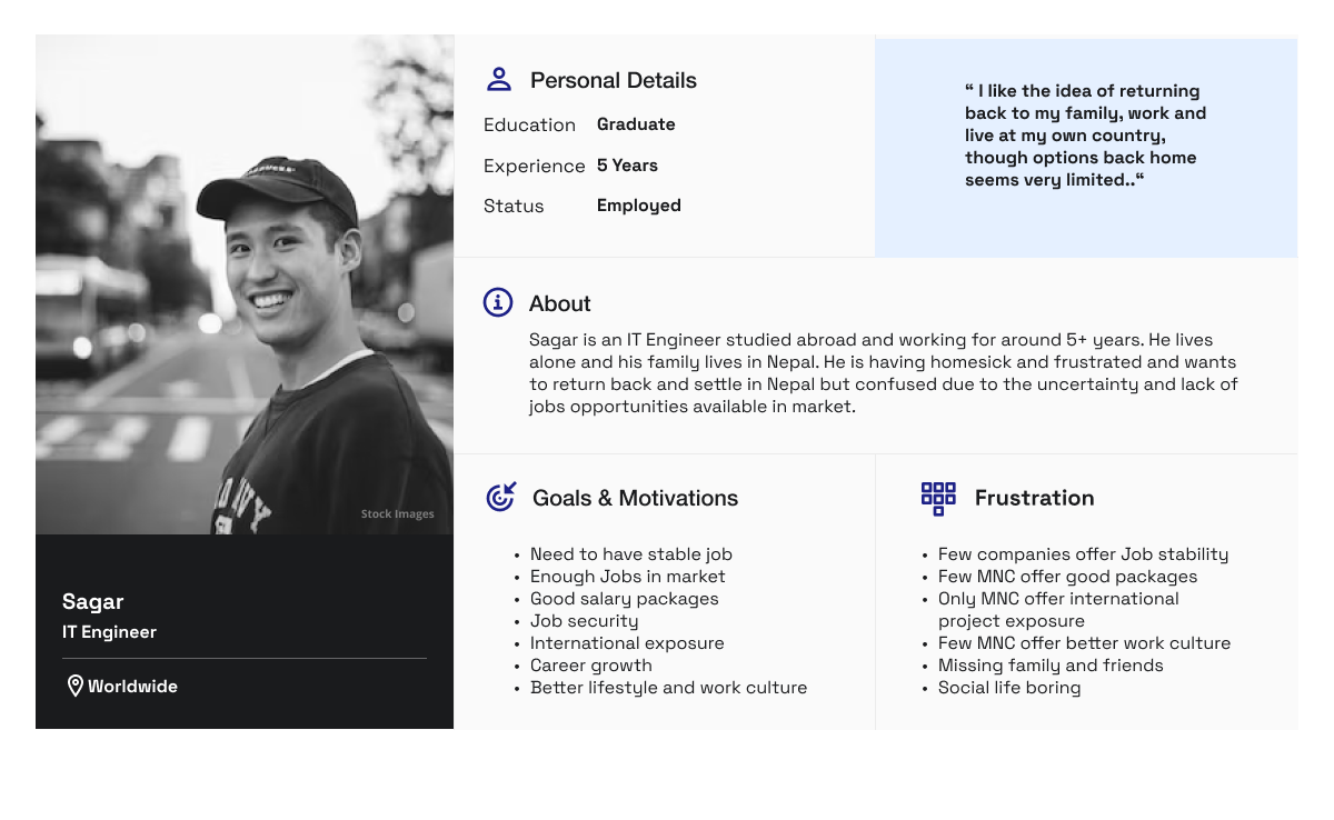
From the above information analysis from interviews, observations, and secondary research, I created a solid user persona which further helped me define the goals and scope of the project.
Based on the information gotten from the foundational research, I created a persona of two person, one local Nepalese student and International Nepalese student whose demographics, motivations, goals and frustrations represent the needs of the users. We used different personas who are in a need of a job. We used two Personas and understand with their perspective.

Affinity Diagram
Now we know the exact problems faced by our users. So, what next? A goal statement was created to ensure a problem-solution fit. We collected all the findings of the research and journey map visualized in the affinity map.
Affinity Maps are a good way to represent all your findings in one place when you working in a team. It helps to reduce the misinterpretations and misunderstandings between the teammates.

Phase 3
Ideation
We did the Brain Storming and came up with final ideas. Designing a website focused on raising awareness, and using a narrative approach to showcase the power of entrepreneurship and promoting local business.
Sketching
Some rough designs we drew on paper to imagine to get the idea of how would it look like, what things needed to be added and where so that it is easily accessible to the people.
With the user flow mapped out, I then proceeded to sketch wireframes. Several iterations of each screen were drafted on paper to ensure that the elements that made it to the digital wireframes effectively addressed the user pain points.


Phase 4
Prototyping
Low Fidelity Wireframes
Designing a website focused on raising awareness, and using a narrative approach to showcase the power of entrepreneurship and promoting local business.


Color palette
It is necessary to ensure that the colour we choose to make them feel warm and secure as they are sharing various personal details.


Typography
Choosing the right pair of fonts is very important as it determines the eligibility of the letters and words.


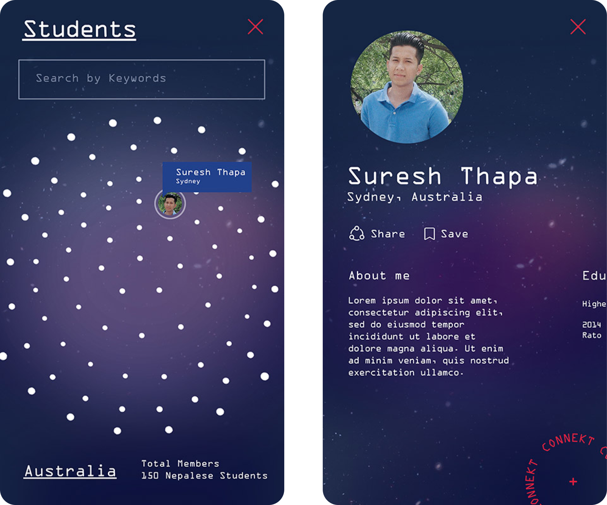
Final Prototype
My initial focus was all on the connection and link . I wanted to create something where people could visualise all the little dots as a person/community and can be connected via this platform. “Connekt” brand name symbolises here is to connect Nepalese students studying abroad to Nepalese companies.
Here “K” has been selected because it gives shape to our Nepal flag. Nepal Flag is two overlapping red triangular pennants with a large blue border. The national flag of Nepal is the world's only non-quadrilateral flag and I wanted to promote its uniqueness in logo, so it can be easily related by students. I have used blue and red color in website.
The brand color has been inspired from Nepal flag. The crimson red and blue that indicates bravery of Nepali people and represents peace and harmony. Then came the idea of comparisons and viewing statistics of each system because I wanted to provide valuable information beyond the visuals.
Clean, airy, minimal, modern, white, and simple. Clean, airy, minimal, modern, white, and simple. I was extremely inspired by the simplicity of these maps.
The forms and the colors of the lines are the focus and the background is almost undetectable. The lines are big, bold, and bright. It was important to keep the other areas of the design as simple and as clean as possible.


Phase 5
Testing
During this stage, I conduct a usability test for the app that was created through video calls and in-person interaction. By testing the design at this stage, I could observe an interaction that most closely resembles a real-life interaction with the final product.
Testing a product with real users helps give a new perspective on things: Through my usability studies, I was reminded that each individual is unique. So the best way to learn about the usability of a product is by testing it with different people.


The Outcome
This was a really exciting and fun project for me to work on as it provides real value, involved a ton of research, and detailed interaction work.
However, shifting priorities and changing roadmaps have delayed the launch of this feature. Still, I learned some important takeaways from this project related to product and business processes. How to adapt to changing requirements New timelines, resourcing issues, and reprioritization meant the scope of the project was constantly changing.
I had to adapt to those changes and still deliver the best design in time with tight deadlines. Always fight for good UX. I had to work under very strict technical constraints, but still fight for what I believe is essential to having a good user experience.
Some very strong words
"At Connekt, our mission is rooted in building bridges — connecting Nepalese students studying abroad with meaningful opportunities back home. We needed a platform that could carry this vision with clarity, purpose, and heart. Prakash Rai helped us bring that to life. Through thoughtful UX/UI design, he created an experience that feels both local and global — intuitive, welcoming, and deeply human. His design work captures the essence of what Connekt stands for: opportunity, connection, and national development. It’s more than a platform — it’s a movement, and his design gave it a voice."
— Rajendra Sharma, Co-founder, connekt
