


The Role
As the Lead UX/UI Designer, I led the end-to-end design of Delivo—from research and concept development to wireframing, prototyping, and testing. I collaborated closely with stakeholders to ensure the solution was scalable, intuitive, and inclusive. I also managed the design system, coordinated user testing across age groups, and translated business needs into actionable product flows.
Project Summary
Delivo is a unified mobile platform that merges food delivery and courier services into a single, intuitive app. The project was initiated to solve the inconvenience of switching between separate apps for different delivery tasks. With Delivo, users can seamlessly toggle between ordering meals and sending parcels, making it ideal for busy individuals, small businesses, and students. By combining smart cart functionality, real-time tracking, and simplified UI, the app helps users accomplish both personal and professional tasks faster and more reliably.
The Challenge
- Fragmented experience due to multiple apps for food and courier delivery
- Poor tracking and lack of transparency in courier workflows
- Inconsistent UI in food ordering processes, especially at checkout
- Limited accessibility for senior or less tech-savvy users
- Lack of brand trust due to poor feedback loops and unclear confirmation stages
The Goal
- Combine food and courier delivery in one seamless experience.
- Design intuitive, accessible flows with smart toggling between services.
- Improve real-time tracking, order transparency, and overall user satisfaction.
- Ensure UI adapts well across age groups and tech skill levels.
- Establish a visual language that builds trust and supports future feature scaling (e.g., groceries, ride-sharing).

Phase 1
Discover
& Empathize
Methods
- User Interviews (12 participants from target demographics)
- Surveys (50+ responses via Google Forms)
- Contextual Inquiries (observing users use existing apps)
- Competitor Analysis (Uber Eats, DoorDash, Delhivery)
Additional Research Stats
- Global food delivery market projected to reach $154.3B by 2023 (CAGR 7.5%).
- Mobile app usage hit 218 billion downloads in 2020 (Statista)
- 3 in 5 users use more than one delivery app regularly
- Asia-Pacific leads app usage growth (India, China, SE Asia)
Key Insights
- Service integration reduces user fatigue.
- Simplicity and guidance win user trust.
- Customization and responsiveness are essential across age groups.
- Real-time tracking and order clarity are must-haves.
Phase 2
Define
We translated our research into actionable problem statements and design principles. We identified two core user types through research—a young professional and a small business owner. By mapping their needs, behaviors, and pain points, we defined clear design goals to create a finance app that feels simple, supportive, and culturally relevant.
User Persona 1:
Sarah Thompson – The Entrepreneur
- Uses app for courier tasks to deliver handmade goods
- Needs speed, reliability, and proof of delivery
- Multitasks heavily and wants clear, efficient workflows
User Persona 2:
John Milton – The Budget-Conscious Student
- Orders food often; looks for discounts and reordering ease
- Prefers fast UX with few taps
- Uses reward systems and gamified experiences
User Persona 3:
Emily Boulware – The Remote Worker
- Uses apps for both food and document delivery
- Needs seamless multitasking tools and centralized history
- Prioritizes support options and smooth service toggling


Phase 3
Ideation
To begin ideation, I framed the central question: "How might we design a dual-purpose delivery app that is both intuitive and efficient across user types?". I explored - Toggle interface to switch between food and courier modes. Smart cart that adapts to order type. Dynamic content cards with real-time updates. Micro-interaction feedback for confirmation, edits, and tracking.
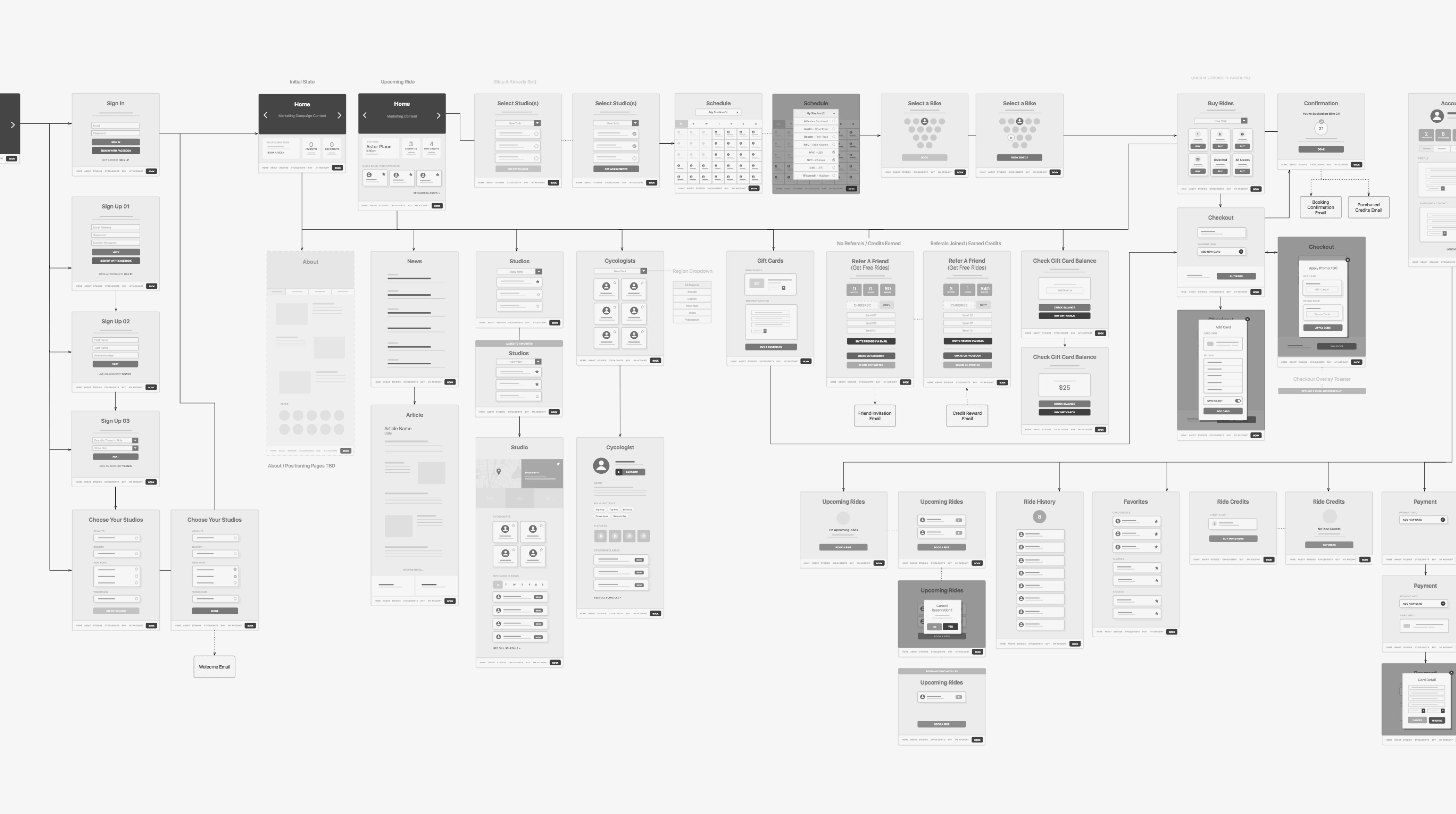
Wireframes & Sketches
Early sketches explored tab toggling, order preview drawers, and simplified tracking. Low-fidelity wireframes focused on structure: tab bar, CTA placement, and form flows. Mid-fidelity wireframes added content hierarchy, dynamic scrolls, modals, and error states. Iterative feedback helped shape the final structure before UI design began.
Phase 4
Prototyping
To bring the design to life, I focused on creating a clear and friendly visual system grounded in function and accessibility. This phase included designing a flexible UI kit, color system, typography standards, and reusable components—all built for consistency across food and courier modules. Every decision was informed by previous user testing insights and scalability needs.
Color palette
The color palette was crafted to support both engagement and usability. Soft greens were used for primary actions and call-to-actions (CTAs), offering a calming but energetic tone. Monochrome backgrounds helped declutter visual noise, while warmer contrasting hues were used strategically for alerts or error states to ensure immediate visibility without overwhelming users.


Typography
In terms of typography, I chose Manrope for its clean, geometric form that balances modern appeal with strong readability across devices. Its scalability across font weights and sizes made it suitable for use in both headings and body content, especially critical for senior users and varying screen contexts.
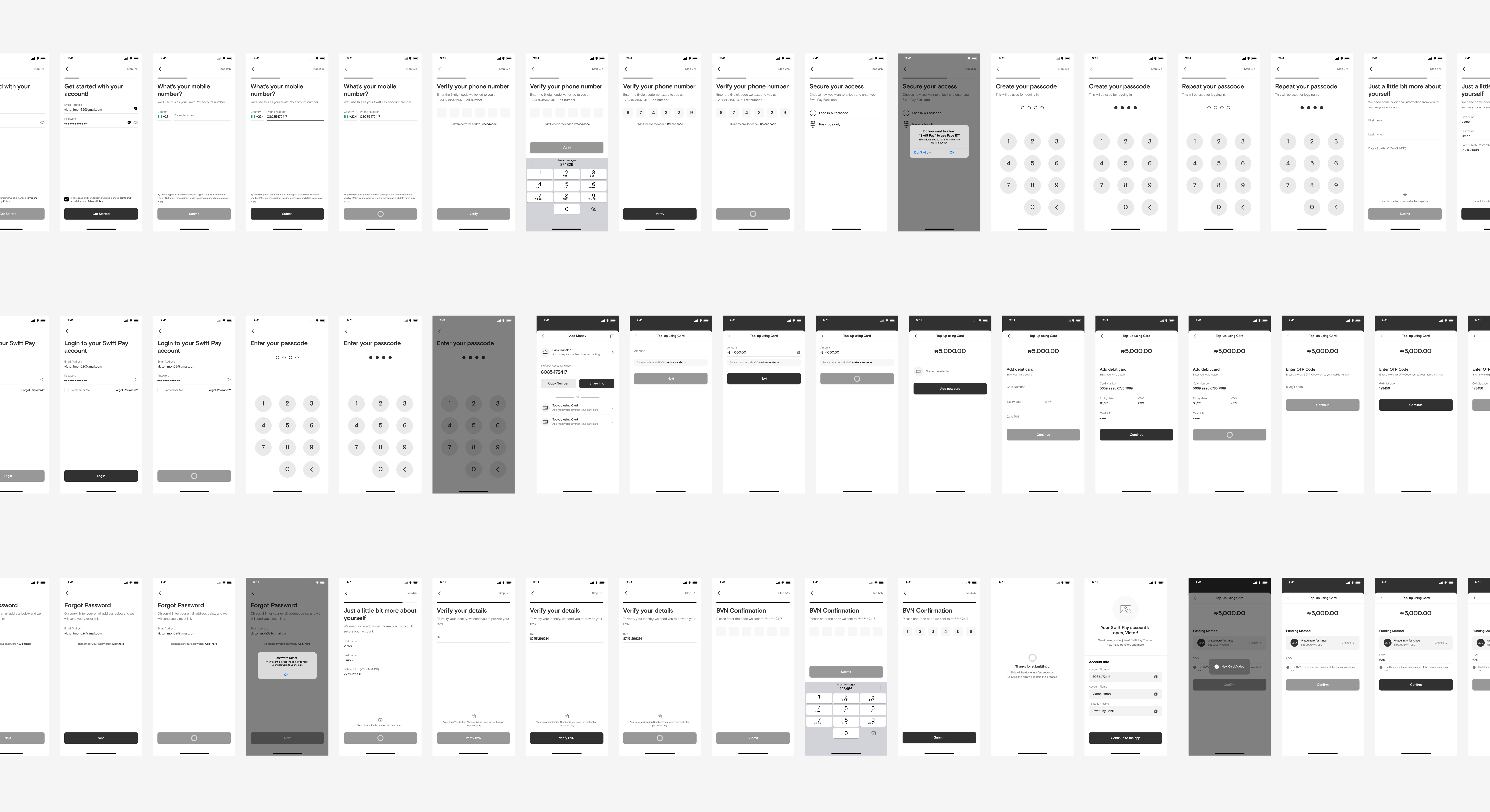
Final Prototype
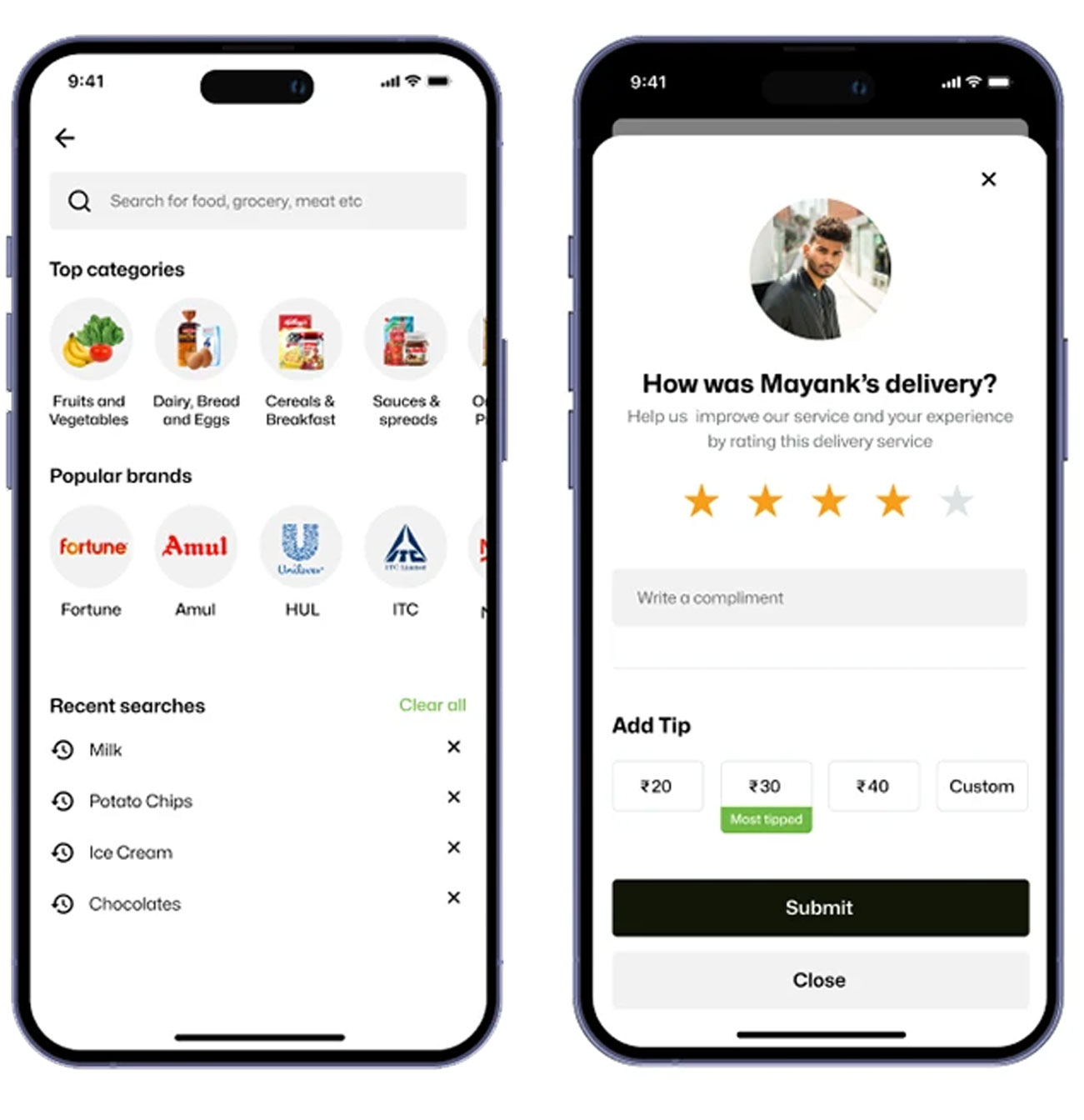
The final prototype was built in Figma using an 8pt grid system to ensure structural consistency. It included interactive flows such as placing a food order, scheduling a parcel, and tracking both in real time. A component library was created to manage various states like hover, active, error, and success—ensuring a predictable and maintainable system.


Phase 5
Testing
Usability testing was conducted in two rounds with diverse participants across age groups to ensure inclusivity and flow clarity. The first round included 10 users completing essential tasks like placing food orders and scheduling parcels. The second round expanded to 14 participants and offered key improvements based on earlier observations. This phase validated interaction models, task completion rates, and interface comprehension in real-world scenarios.
During testing, the app’s major usability issue—difficulty finding the “Add Group” button—was resolved. The majority of participants reported a smoother experience. Additionally, several participants praised the visual design without prompting, and others found the embedded expert tips helpful, indicating strong support for both form and function.
Design Improvements
Key updates included clearer form labels, larger tap targets, and smoother transitions. These refinements boosted clarity and minimized confusion, especially for checkout steps and interactive elements like real-time tracking.

The Outcome
Task completion time improved from 3.5 to 1.7 minutes. Satisfaction scored 4.6/5, and 82% of participants chose Delivo over using separate apps. The results confirmed that a unified, accessible interface meets user needs more effectively.
Conclusion
Delivo proves how combining multiple delivery services into a cohesive interface can elevate user convenience and business potential. With a modular design system and robust testing, Delivo offers a scalable foundation for integrating groceries, pharmacy delivery, or even ride-sharing in the future. This project reinforced the value of accessible UX, trust signals, and guided transitions across services.
Some very strong words
"Prakash brought clarity and strategic thinking to every design decision. From wireframes to final UI, his work made Delivo feel like a polished, scalable product. His focus on accessibility and user flow was instrumental in shaping an app that truly feels intuitive and useful. We’re excited about where this foundation can take us next."
— Abhishek Batara, founder
