Clientease

A Thoughtful Redesign of a Client Relationship Platform and to Empower Small Businesses.

Clientease is a lightweight, all-in-one client relationship platform designed for freelancers and small agencies. It helps users manage leads, craft proposals, send invoices, and maintain smooth communication across the client lifecycle. By 2024, while the platform’s functionality was sound, its interface had grown outdated and difficult to navigate. My team was brought in to lead a full UX/UI redesign—modernizing the product, enhancing its usability, and aligning the experience with the needs of time-constrained professionals managing growing client bases.

Product
Clientease
Industry
SaaS – Client Experience & CRM
Year
Aug '2024
My Role
UX/UI Designer
Deliverables
User research, usability audits, UX strategy, wireframes, interactive prototypes, high-fidelity UI
Single Image

The Role

As the lead UX/UI designer, I was responsible for conducting end-to-end design activities — from user research and experience strategy to wireframing, prototyping, UI design, and usability testing. My goal was to align user needs with business goals and deliver a product that felt effortless, modern, and made for professionals on the move.

Project Summary

Clientease is an all-in-one client relationship platform that streamlines the full client lifecycle—from lead acquisition to invoicing. The platform had grown functionally rich but visually outdated and unintuitive. I was brought in to lead a comprehensive product redesign focused on improving usability, reducing cognitive load, and helping users manage their client operations more efficiently.

The Challenge

The core functionality of Clientease remained relevant. However, its interface had become cumbersome and unintuitive. Key workflows such as client onboarding, proposal sending, and invoicing lacked clarity, leading to user drop-offs. Users were struggling to find value quickly, and even power users found certain features hard to navigate.

The Goal

Our goal was to transform Clientease into a platform that:
  • Modernize the user interface to increase clarity and trust.
  • Simplify onboarding and workflows for time-strapped professionals.
  • Enhance the overall user experience with intuitive layouts and clear call-to-actions.
  • Unify the entire client lifecycle management under one simple interface.
  • Encourage adoption through improved first-time use and daily engagement.
Single Image
Phase 1

Discover
& Empathize

Stakeholder Interviews

The founders of Clientease were clear: help users close clients faster. They emphasized a strong commitment to simplicity and automation for small teams, which informed our UX strategy from the start. The desire to help users “close clients faster”. A focus on freelancers and small agency owners. Existing challenges in feature discoverability and onboarding.

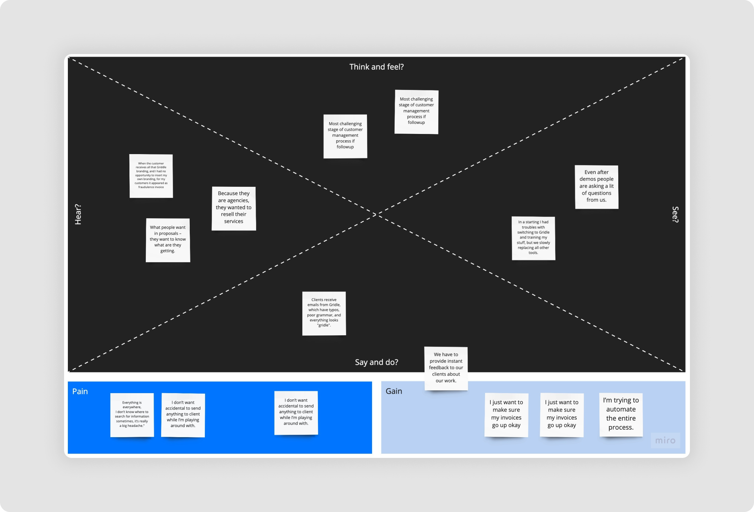
Behavioral Analytics Review

We used Inspectlet to watch how users interacted with the existing product. We uncovered:
  • Users skipped over critical onboarding steps.
  • Proposal creation and invoicing were commonly bottlenecks.
  • Some features were barely discovered or used.
  • Interest in Custom Plans: 92% said they would love an app that provides tailored recommendations.

User Interviews

We used Inspectlet to watch how users interacted with the existing product. We uncovered: Conducted six one-on-one interviews with users from diverse industries, including three freelancers specializing in marketing, consulting, and development, and three agency owners representing design, software, and content services.

Key Insights

  • Users felt overwhelmed during first-run experience
  • They wanted proposal and invoice flows to be faster and more guided
  • Needed one centralized place for client documents and communication
  • Desired a more human tone in reminders and system messages
Single Image
Phase 2

Define

Problem Statement

"Users of Clientease struggle with task prioritization, onboarding clarity, and scattered data. The product needs to deliver a more focused, frictionless, and integrated experience to retain and convert users."

User Persona 1:
Melina – The Independent Consultant


  • Wants a tool that’s quick to learn and easy to use.
  • Values simplicity and clarity in invoicing and proposals.
  • Struggles with keeping client conversations and documents in one place.

User Persona 2:
Jack – The Agency Owner


  • Manages a small team and multiple client accounts.
  • Needs better visibility into lead pipelines and team activity.
  • Expects automation but also flexibility and customization.
Single Image
Single Image

UX Strategy & Design Principles

To address user pain points and align with business goals, we anchored our work around the following principles:

  • Clarity over complexity: Surface what matters most and reduce decision fatigue.
  • Context-aware guidance: Help users take action based on where they are in the product journey.
  • Flexible, not fragmented: Let users personalize their workflows without overwhelming them.
  • Effortless professionalism: Ensure every action—sending a proposal, following up—feels polished and intentional.
  • Unified experience: Bring together all touchpoints (leads, clients, proposals, invoices) into one seamless flow.
Phase 3

Ideation

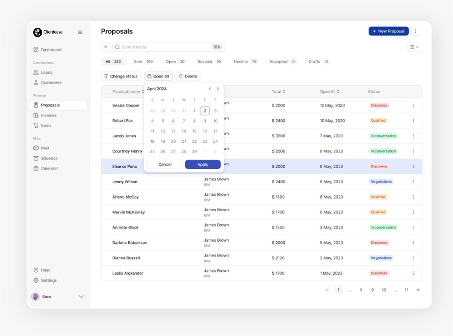
We mapped the typical user journey from first login to sending an invoice, uncovering friction points that informed our redesign priorities. Proposal creation was streamlined into a 3-step guided flow, while onboarding was restructured with action-oriented prompts to boost early engagement. Dashboards were made adaptive based on whether users were new or returning, ensuring relevant content at each stage.

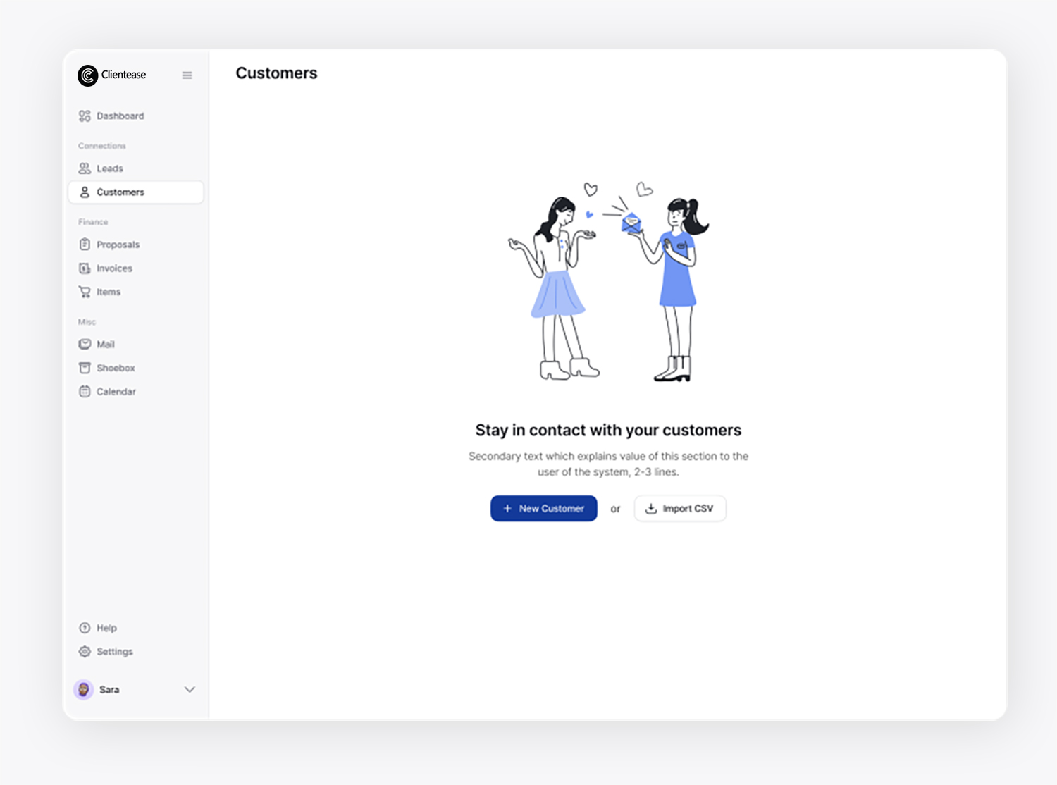
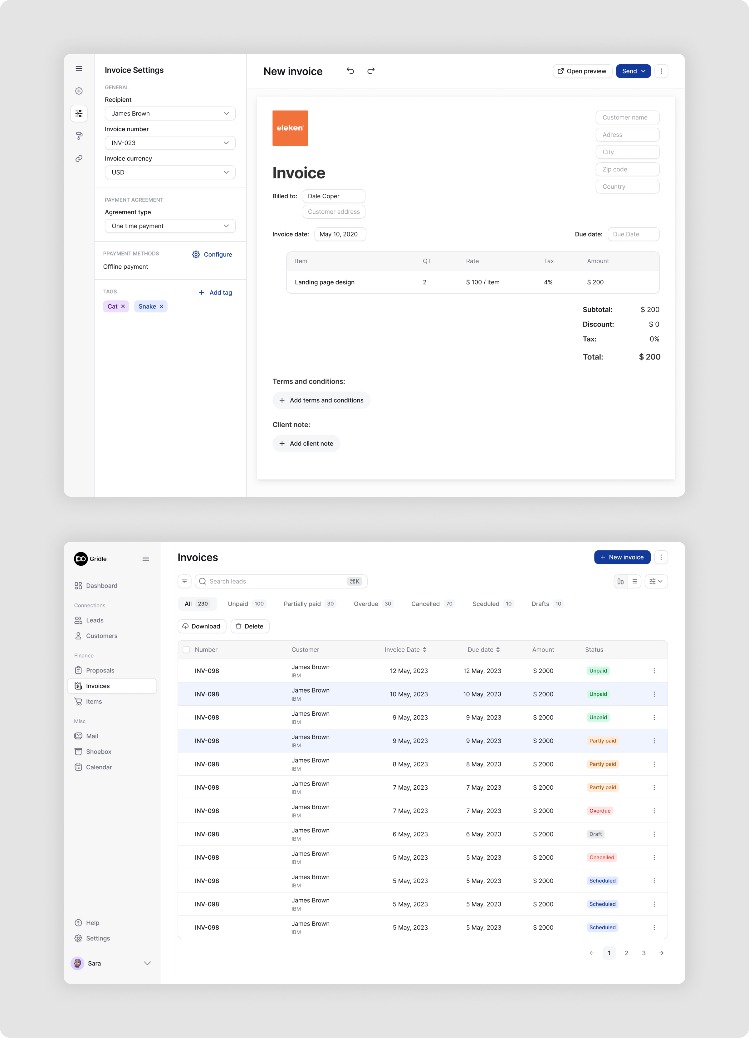
Low-fidelity wireframes were developed for key modules—including the dashboard, lead management (Kanban and List views), client directory, proposal builder, and invoice generator—enabling rapid iteration and validation of the redesigned user experience.
Single Image
Single Image
Phase 4

Prototyping

Visual Direction

  • Typography: Inter for readability, semi-bold for CTAs
  • Color Palette: Calming blues and neutrals to communicate trust
  • Icons: Custom minimal iconography that aligns with SaaS best practices

High-Fidelity Designs

Interactive prototypes were created in Figma and tested with the internal team, followed by user validation sessions.
Single Image
Single Image
Single Image

Final Design Execution

The final prototype introduced a modular dashboard built with customizable widgets, allowing users to tailor their workspace based on their priorities. An interactive proposal status flow was designed to clearly visualize each stage—from draft to sent, opened, and accepted—making progress tracking intuitive. Onboarding was personalized to guide users through key actions based on their role and goals, ensuring a smoother start. Additionally, a document manager was integrated within each client profile, enabling centralized access to contracts, proposals, and invoices, all in one place.


Onboarding & First-Run Experience

We redesigned onboarding as a guided, goal-oriented journey rather than a product tour. The new experience:
  • Presents users with two clear options: “Add First Client” or “Import Contacts.”
  • Offers contextual tooltips that surface based on real-time user behavior.
  • Uses Intercom Product Tours to walk users through essential features.
Single Image
Single Image
Single Image
Single Image

Dashboard

The new dashboard adapts to each user's state:
  • New users are guided with visual steps: Add a client → Create proposal → Send invoice.
  • Returning users see high-level overviews of open leads, proposals awaiting response, and upcoming tasks.
  • Widgets are modular, allowing users to prioritize the metrics most relevant to them.
Single Image
Single Image

Leads & Sales Pipeline

We introduced both Kanban and List views for lead management, catering to different user preferences. The new design includes:
  • Inline editing of lead status, tags, and notes
  • Quick actions like email, call, and schedule follow-up
  • A visual funnel summary that tracks lead health over time
Single Image

Customers

We rebuilt the client database to function as a true command center:
  • Fully filterable and searchable
  • Bulk actions for messaging, tagging, and data updates
  • Unified timeline showing every interaction with a client
  • Ability to invite clients to a secure portal for collaboration
Single Image

Proposals

We transformed proposal creation into a faster, more elegant experience:
  • Pre-built templates with editable sections
  • Visual indicators for proposal status (Draft, Sent, Opened, Accepted)
  • One-click conversion of proposals to invoices
  • Smart content suggestions to help users draft proposals more efficiently
Single Image
Single Image
Single Image
Single Image

Invoicing

The invoicing flow was completely redesigned for speed and clarity:
  • Templates auto-filled from client and proposal data
  • Tax-ready formatting and multi-currency support
  • Smart reminders with tone settings (e.g., “Friendly,” “Formal”)
  • Instant PDF generation and payment tracking
Single Image

Other Final Screens

Each was designed to ensure consistency, clarity, and responsiveness across the platform—completing the overall user experience.
Image 1
Image 2
Image 3
Image 4
Image 5
Image 6
Image 7
Image 1
Image 2
Image 3
Image 4
Image 5
Image 6
Image 7
Phase 5

Testing

We conducted moderated usability testing with five participants from various industries, focusing on core tasks such as onboarding, proposal creation, and lead management. The tests revealed high overall task success rates and valuable feedback that led to targeted UI improvements. Based on insights, we refined widget visibility, added contextual helper text, and enhanced form interactions to support a smoother user experience.

Key Findings:


  • Send a proposal: 100% completion — Users found it significantly faster than before.
  • Create and track leads: 100% completion — Kanban-style flow was highly appreciated.
  • Customize dashboard: 60% completion — Some users were confused by widget editing.
  • Set up invoicing: 80% completion — One user missed the auto-fill prompt.

Following the tests, we introduced further UI refinements, including improved visibility for widget controls and helper text near form fields.
Single Image

The Outcome

The redesigned Clientease platform delivered measurable improvements across both user engagement and efficiency. Users were able to complete core tasks—such as sending proposals and invoices—three times faster than before. Retention rates doubled week-over-week, suggesting a strong emotional and practical connection to the new experience. Importantly, onboarding friction was dramatically reduced, with a 50% decrease in drop-offs thanks to clearer pathways and contextual guidance. The overall usability enhancements encouraged users to generate more proposals and invoices per session, directly contributing to the platform's business performance.

Conclusion

The Clientease redesign wasn’t just about refreshing UI—it was about rethinking the user journey from the ground up. By anchoring design decisions in real user needs, we created an experience that feels intuitive, focused, and empowering. The product now supports the pace and professionalism small businesses expect while maintaining the flexibility they require. This project remains one of the strongest examples of how strategic UX can turn a functional tool into a delightfully usable one.

Some very strong words

“The redesign not only modernized the look of Clientease, but it made our product significantly more useful. We started seeing better user feedback, and early adopters of the new version were genuinely excited. The clarity and polish really elevated our offering.”

— Kaycee G., Co-founder