Taxlify

Simplifying Tax Credit Engagements for Accounting Firms, aimed to simplify this workflow through automation and collaboration tools.

Taxlify is a specialized platform that helps CPA firms and consulting practices streamline the complex process of conducting R&D tax credit studies for their clients. Although the tax credit process can yield significant benefits, it involves heavy documentation and compliance—a burden most firms struggle to manage at scale. Taxlify aimed to simplify this workflow through automation and collaboration tools.

Product
Taxlify
Industry
Fintech · TaxTech · B2B SaaS
Year
Sep '2024
My Role
UX/UI Designer
Deliverables
UX Audit, Wireflows, High-Fidelity UI, Design System, Prototypes, Usability Testing/div>
Single Image

The Role

When the Taxlify team approached me, they had already developed a set of mockups and a foundational concept. Their core objective was to improve usability, navigation, and visual consistency across the product. However, they faced a major roadblock: no in-house UI/UX expertise to bring the product to life. The startup had previously worked with multiple freelance designers, but due to the product’s complexity and the need for accounting-specific knowledge, none had succeeded in delivering a scalable, intuitive interface.

Project Summary

The R&D tax credit provides companies with a powerful opportunity to reduce their income tax liabilities—but claiming it is a notoriously complex and documentation-heavy process. As a result, many businesses turn to accounting and advisory firms for help. However, these firms often lack the internal capacity to manage this intricate work efficiently. Taxlify was built to solve this problem. The platform serves as a dedicated tool for accounting, consulting, and tax law firms to offer streamlined R&D tax credit services. It aims to simplify collaboration, documentation, and compliance, while handling the nuances of tax workflows through technology.

The Challenge

Taxlify was tackling a highly technical problem space—tax law, financial compliance, and client collaboration—all within one platform. The existing mockups lacked cohesion. Navigation was unclear, the information architecture was fragmented, and users didn’t receive proper feedback or guidance through their tasks. There were also no distinct flows for firm-side users versus clients, leading to confusion across the board.

The design also had to conform to the limitations of an in-house React-based component library, which restricted stylistic choices but offered speed and consistency in implementation.

The Goal

  • Simplify user flows for both firms and their clients across complex tax workflows.
  • Redesign navigation to reflect user mental models and support scalability.
  • Create clear distinctions between firm-side and client-side interfaces.
  • Build on top of an existing UI framework without sacrificing UX quality.
  • Support collaboration and communication around document requests, questionnaires, and timelines.
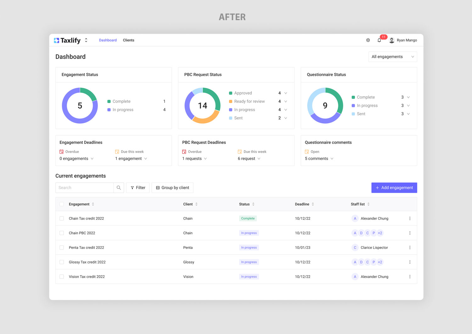
  • Deliver a high-fidelity, launch-ready MVP that would help the startup acquire real users and test the market.
Single Image
Phase 1

Discover
& Empathize

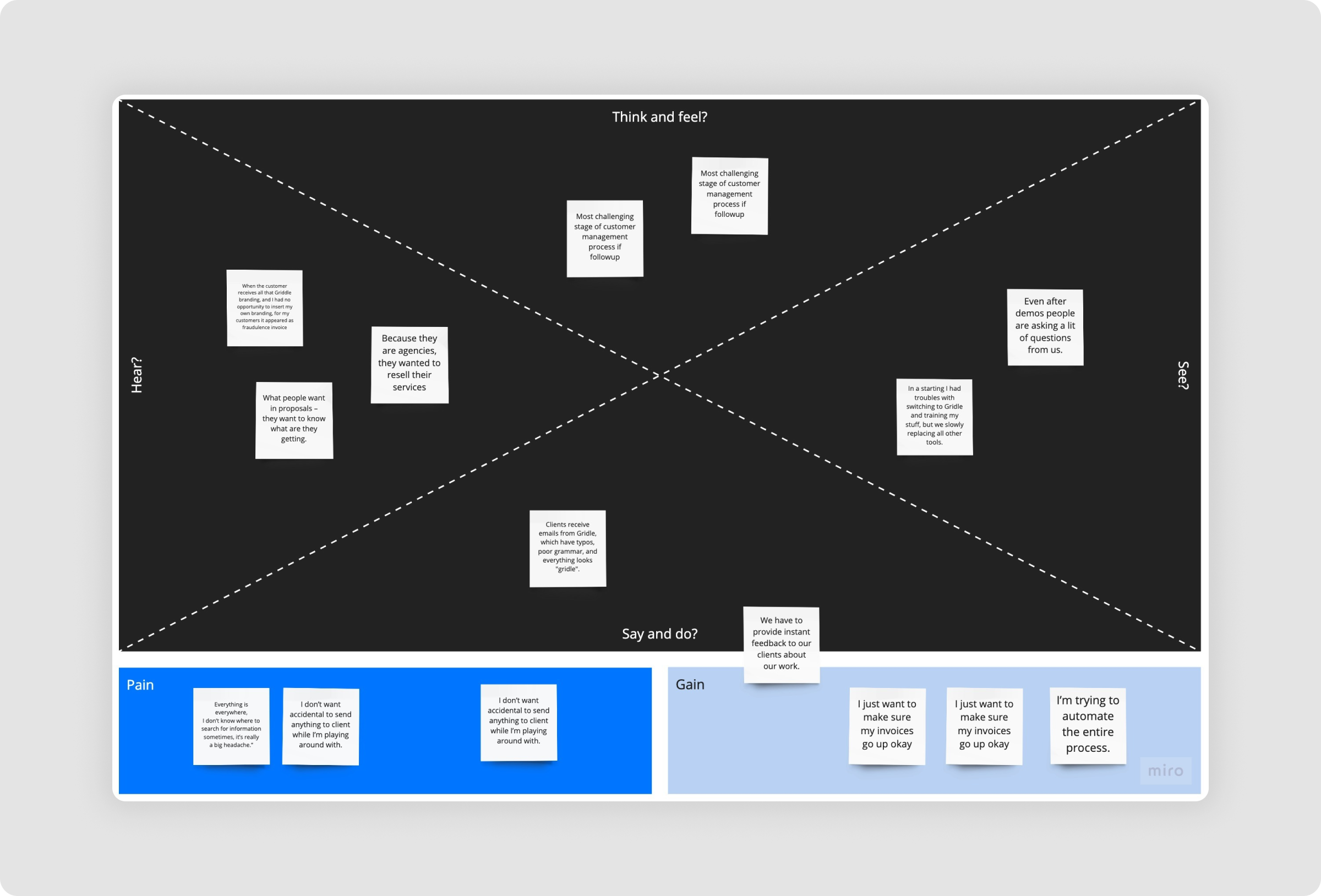
The team had a strong grasp of the technical domain but lacked structured UX thinking. I began with a full audit of their current product and prototypes, mapping out key frictions. User interviews with internal stakeholders highlighted common pain points: users couldn’t track where they were in the app, questionnaires were overwhelming, and document handling relied too much on offline communication.

Key friction points included:

We used Inspectlet to watch how users interacted with the existing product. We uncovered:
  • Users couldn’t edit or revisit created projects.
  • Navigation state didn’t reflect the current page.
  • The layout of forms and tables lacked visual alignment and hierarchy.
  • No built-in collaboration tools between firms and clients.

Single Image
Phase 2

Define

I identified two core user types with different needs:

  • Firm Partners/Managers needed to manage multiple clients, monitor engagement statuses, and track requests efficiently.
  • Client Representatives (like CFOs) needed to quickly understand requests, upload documents, and complete questionnaires—often with no background in tax or accounting.
This distinction became central to defining the structure of the platform, ensuring tailored dashboards and interactions for each side.
Single Image
Single Image
Phase 3

Ideation

To begin resolving the identified challenges, I focused on breaking down workflows into clear, manageable steps. I used task-based design thinking to map user flows and identify opportunities to reduce steps or automate tasks. The platform’s React-based component system introduced design constraints. I embraced this by standardizing layouts, spacing, and hierarchy using existing UI primitives, while enhancing the experience through microinteractions, iconography, and contextual feedback mechanisms.

The first feature to tackle was the Questionnaire section, followed by the Dashboard, Navigation, and Document Requests.
Phase 4

Wireframes & Prototyping

To improve clarity and usability, the questionnaire was restructured using clear headers, spacing, and grouped fields, making it easier to complete. Comment threads were added to enable firm-client collaboration directly within forms. Meanwhile, navigation was simplified with a two-tiered system: a top bar for global sections and a sidebar for engagement-specific tasks. Breadcrumbs were also introduced to support smooth, intuitive movement across different levels of the platform.
Single Image
Single Image

Final Design Execution

Auditing the Existing Experience

  • Reviewed incomplete mockups and workflows to identify usability gaps.
  • Discovered disconnected navigation, unclear task flows, and missing context.
Single Image
Single Image

Structuring the Platform

The new dashboard adapts to each user's state:
  • Reorganized pages and created a unified architecture for firms and clients.
  • Introduced two-tier navigation, breadcrumbs, and modular workspace views.
Single Image
Single Image

Standardizing Interaction Patterns

  • Defined consistent patterns for empty states, data entry, and system feedback
  • Simplified client tables and created reusable UI blocks for future scalability.
Single Image
Single Image
Single Image

Enabling Collaborative Workflows

  • Designed a two-sided documentation system (PBC) with status tracking.
  • Added commenting, tagging, and notification flows for real-time collaboration.
Single Image
Single Image
Single Image

Extending Core Functionality

  • Built a dynamic Report Builder to summarize submitted data into exportable tax reports.
  • Prepared the product for broader use cases across audits and advisory services.
Single Image
Phase 5

Testing

I ran moderated usability tests with five users representing both firm and client personas. Tasks included uploading documents, completing questionnaires, and navigating between clients and engagements. Most users completed tasks easily, highlighting that the interface felt “clear,” “predictable,” and “simple—even for non-tax people.” Improvements were made to the engagement switcher and layout responsiveness based on this feedback.

>
Single Image

The Outcome

With the redesigned MVP, Taxlify successfully launched and acquired its first wave of paying clients. The platform enabled accounting and advisory firms to offer R&D tax services more efficiently, while also opening new service verticals such as audit and legal document handling. User onboarding time was significantly reduced, and feedback from early adopters indicated that the tool gave smaller firms the power to scale without hiring large support teams. The clarity and flexibility built into the UX allowed Taxlify to differentiate itself from traditional solutions—and achieve product-market fit faster than anticipated.

Conclusion

Designing Taxlify was a deep dive into simplifying complexity. By restructuring the product architecture, refining user flows, and creating scalable design patterns, we transformed a technical, compliance-heavy platform into a clean, intuitive tool that both firms and clients could use with confidence.

The redesign not only improved usability but also enabled the business to scale, acquire its first customers, and expand into new revenue streams. Most importantly, it positioned Taxlify as a modern, trustworthy solution in a traditional industry—proving that good design can unlock market fit even in the most specialized domains.

Some very strong words

“Before the redesign, our product was messy and hard to use—even for our own team. What we have now is clean, focused, and incredibly intuitive. It helped us onboard clients faster and scale with confidence. The UX clarity became one of our biggest competitive strengths.”

— Andy Haller, Co-founder